Styling
Change how a figure looks: the light or the dark theme, every colour, font and
size a figure shares through Theme, and the profiles, tokens and shared axes
that keep a set of figures consistent.
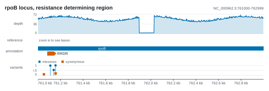
A theme is chosen per figure:
On the command line
--theme light or --theme dark picks the theme, and --color '#d55e00'
recolours a coverage, feature or junction track. Every other setting on this
page is set from Rust.
The two themes
Theme::light() is deep indigo ink on a white page, for manuscripts and slides,
and the default. Theme::dark() is light ink on a deep indigo page, the one the
documentation site draws its figures on at night, for dark-mode documents and
screens.
The dark theme is a selected set of colours, not an inversion of the light one. A dark page wants its marks lighter and a narrower band of lightness than a white one, so a flipped light palette puts half its colours outside that band and some of them stop being distinguishable. The two palettes name the same six hues in the same order, each measured against its own page, so a figure keeps the names of its colours when it changes page: the first series is indigo on either. Nothing converts a light figure into a dark one, so the page a figure is going on is decided before it is built.
A theme goes on a figure with theme(...) on Plot, Figure, Rings, Map
and PhyloMap. On Panels it styles only the sheet's own page, title, letters
and captions: each panel keeps the theme it was drawn with. Theme derives
Debug, Clone and PartialEq, and its Default is Theme::light().
Every field
Theme is a plain struct with every field public, so there is no builder to
learn: start from Theme::light() or Theme::dark() and overwrite what you
need.
| Field | Type | light() |
dark() |
What it is for |
|---|---|---|---|---|
background |
String |
#ffffff |
#120b2b |
the page; "none" for a transparent SVG |
foreground |
String |
#1a1233 |
#efeaff |
titles, branches, text drawn on marks: the strongest ink |
muted |
String |
#5b5480 |
#b3a9e0 |
secondary text: track names, tick labels, the locus, legends, captions |
rule |
String |
#e4def5 |
#2e2558 |
quiet baselines, the ruler, guides |
accent |
String |
#1634c2 |
#6275fc |
a track that was not given a colour |
palette |
Vec<String> |
six colours | six colours | categorical colours, handed out by color(index) |
bases |
BaseColors |
conventional() |
conventional() |
nucleotide colours |
insertion |
String |
#8e44ad |
#c59fe1 |
an insertion mark in a read pileup, kept off the palette so it never passes for a series |
corner_radius |
f64 |
3.5 |
3.5 |
the corner radius of a data mark, in pixels |
font_family |
String |
Inter, Liberation Sans, Arial, Helvetica, sans-serif |
the same | the font stack written on the root <svg> |
mono_family |
String |
JetBrains Mono, Liberation Mono, Menlo, Consolas, monospace |
the same | coordinates: the ruler and the locus beside the title |
font_size |
f64 |
11.5 |
11.5 |
tick labels and in-plot annotations, in pixels |
label_font_size |
f64 |
11.0 |
11.0 |
track names in the left gutter, set semibold |
title_font_size |
f64 |
17.0 |
17.0 |
the figure title |
cap_height_ratio |
f64 |
0.72 |
0.72 |
the height of a capital letter as a fraction of the font size |
tokens |
VisualTokens |
VisualTokens::default() |
the same | stroke, marker, tick, feature, legend and spacing sizes: see tokens |
corner_radius is the one field that is neither a colour nor a size of text.
Rounded ends are most of the difference between a figure that looks drawn and
one that looks emitted; set it to 0.0 for square corners. Features, reads in a
pileup, legend swatches, variable-site cells and open reading frames all use it,
and it is clamped to half the shorter side of each mark, so a short bar becomes a
lozenge rather than losing its shape to an oversized corner.
theme.scaled(factor) returns the same colours and font stack with the three
font sizes, the corner radius and every size in tokens multiplied by factor.
A factor below 0.25 is raised to it, and one that is not finite leaves the
theme as it was. The visual_scale of a figure does this for you: see
named profiles.
The categorical palette
Six hues, indigo, pink, teal, ochre, plum and orange, measured so that every pair stays apart under colour vision deficiency, not only neighbouring ones. The indigo and the pink are the ones karyon's own mark is drawn in.
| Slot | Hue | light() |
dark() |
|---|---|---|---|
| 0 | indigo | #1634c2 |
#6275fc |
| 1 | pink | #e63f9f |
#e4488c |
| 2 | teal | #108169 |
#41f5ea |
| 3 | ochre | #b78a2c |
#fcdc67 |
| 4 | plum | #69437c |
#b7a1f5 |
| 5 | orange | #b0540e |
#ee9a69 |
theme.color(index) reads a slot and wraps at the end, so a track with more
categories than the palette has reuses colours rather than panicking. An empty
palette falls back to accent.
use karyon::Theme;

let theme = Theme::light();
assert_eq!(theme.color(0), theme.accent);
assert_eq!(theme.color(6), theme.color(0));
accent is slot 0 of its own palette in both themes on purpose. accent is
what a single unlabelled series gets; if it were anything else, a figure with
one series and a figure with two would disagree about the first colour.
theme.symbol(index) hands out point shapes the same way (circle, square,
diamond, triangle), and categorical points take a shape and a colour together,
so a category survives a greyscale print.
How the six were chosen
Two categories a reader cannot tell apart are one category, so the default palette is the one that survives colour vision deficiency. It was measured, not chosen by eye. Each slot keeps to a range of hue, so the palette reads as six named colours, and inside each range the lightness and chroma were searched for the pair that ends up furthest apart after simulating protanopia, deuteranopia and tritanopia (Machado, Oliveira and Fernandes, 2009, at full severity). The closest pair of the light six is 10.7 apart in OKLab hundredths, and of the dark six 14.4; the Okabe-Ito set they replace came to 6.7, and the previous dark set to 1.6, two colours a reader with deuteranopia sees as one. Every colour reaches a contrast of 3:1 against its own page, the floor for a mark that has to be seen. A test in the crate holds both palettes to these numbers.
Colour is never the only carrier of identity in karyon: a legend, a letter, a label or a shape always says it too, which is what keeps six enough.
Nucleotide colours
BaseColors holds five colours: one per nucleotide, and other for N and any
other IUPAC or unexpected symbol. bases.of(base) reads one, ignoring case and
treating U as T. Every track that paints a base uses it: the reference
sequence, a mismatch in a pileup, an alignment coloured by nucleotide, a
variable-site cell, a logo letter and a dynseq letter.
| Base | BaseColors::conventional() |
BaseColors::colorblind_safe() |
|---|---|---|
| A | #33a02c |
#009e73 |
| C | #1f78b4 |
#0072b2 |
| G | #e08214 |
#e69f00 |
| T, U | #e31a1c |
#d55e00 |
| other | #9e9e9e |
#9e9e9e |
The conventional set is the default, because a figure that recolours the bases surprises everyone who has used a genome browser. It is also not safe for every reader: adenine and guanine sit 1.7 apart under protanopia, on a scale where 8 is the floor for telling two colours apart, and that is the transition pair, the commonest substitution there is. The colour-blind safe set keeps its closest pair 11.0 apart, under deuteranopia. Its colours are not the ones a reader expects, so label them or say so in the caption.
use karyon::{BaseColors, Theme};

let mut theme = Theme::light();
theme.bases = BaseColors::colorblind_safe();
Blending against the page
A track never writes a colour down. A shade the theme has no field for is mixed
from one it has, so the same code is right on a white page and on a dark one.
One method and three functions do that arithmetic: wash is at the crate root,
and mix and contrast_ink are in karyon::theme.
| Call | Returns | For |
|---|---|---|
theme.surface() |
the background, or a colour standing in for a transparent one | the colour a tint is blended towards |
mix(a, b, t) |
a blended towards b, with t from 0 (all a) to 1 (all b) |
shades that belong to the theme |
wash(color, &theme) |
mix(color, theme.surface(), 0.62) |
the body of a large filled shape |
contrast_ink(color) |
#1a1233 or #ffffff |
text drawn on a colour chosen at run time |
use karyon::theme::{contrast_ink, mix};
use karyon::{wash, Theme};

let theme = Theme::light();
assert_eq!(wash(theme.color(0), &theme), "#a6b2e8"); // the body of a gene
assert_eq!(mix(theme.surface(), &theme.foreground, 0.5), "#8d8999");
assert_eq!(contrast_ink(theme.color(0)), "#ffffff"); // text on #1634c2
surface()exists becausebackgroundmay be"none", and blending against something that is not a colour gives back something that is not a colour: the mark comes outfill="none"and disappears. A quiet matrix cell, the bar under a base that agrees with the reference and the zebra tint on a variable-site panel are all tints towards the page. A transparent page is whatever the SVG lands on, so the theme guesses from its own ink: dark ink means a light page (#ffffff), light ink a dark one (#1a1233).mixis for a greyscale that belongs to its theme. Cytogenetic bands are specified as shades from white to black, and hardcoded shades make a dark figure look like a light one someone forgot to invert; mixing the theme's own background and foreground gives the same ladder in whichever direction the page runs. It reads six-digit#rrggbbonly, and anything else comes back asaunchanged.tis clamped to 0 to 1, and atthat is not a number counts as 0.washis what a large filled shape wears.contrast_inkpicks, for text on top ofcolor, whichever ink has the higher WCAG contrast ratio against it, computed from sRGB relative luminance. Feature labels sit inside boxes whose colour the caller chooses, so the ink is picked per box. A colour it cannot read as#rrggbbis assumed dark and gets white.
Strand
strand_color(strand, &theme) holds the strand convention: the reverse strand
gets palette slot 1, and forward and unknown both get slot 0. Every track that
colours by strand goes through it, so a read pileup and a methylation track in
one figure agree on which colour means forward, and replacing the palette moves
all of them together. A track that wants its own pair still has one, such as
PileupTrack::strand_colors or FeatureRing::colors.
use karyon::{strand_color, Strand, Theme};

let theme = Theme::light();
assert_eq!(strand_color(Strand::Forward, &theme), theme.color(0));
assert_eq!(strand_color(Strand::Reverse, &theme), theme.color(1));
assert_eq!(strand_color(Strand::Unknown, &theme), theme.color(0));
Fonts and text measurement
font_family is written as one attribute on the root <svg> element and
nothing else. No font is embedded and none is fetched, which is part of why the
file opens unchanged in a browser, in Inkscape and in Illustrator. It also means
the viewer must have the fonts: a machine without them substitutes, and text
sets slightly differently there.
That matters because karyon decides how wide a string is before it draws it: the
label gutter, whether a name fits inside its feature, where a title must be set
smaller or shortened. The default stack leads with Inter and falls back to
Liberation Sans, Arial and Helvetica, and which of them draws the text is the
viewer's machine's business. So karyon::svg::text_width(text, font_size)
measures every character as the wider of the two designs, measured one
character at a time: text never runs past its room in either, and in the
narrower one it has a little to spare. text_width_strong does the same for
semibold and bold text, which Inter sets wider, and mono_width measures the
monospaced stack at six tenths of an em a character. One flat width per
character would under-reserve a run of capitals by about a fifth, which is
exactly what a column of sample accessions is. A character outside printable
ASCII counts as a wide one, so an accented name reserves a little too much
rather than too little.
fit_text(text, room, font_size), at the crate root, is the other half: it
shortens a string with an ellipsis until it fits.
use karyon::svg::text_width;
use karyon::{fit_text, Theme};

let theme = Theme::light();
assert!((text_width("ERR1234567", theme.label_font_size) - 69.52).abs() < 1e-9);
assert_eq!(fit_text("NC_000962.3 read depth", 84.0, 12.0), "NC_000962.\u{2026}");
A PDF sets its text in the fonts every reader has rather than in the stack, and
font_family decides only which: a monospaced stack is Courier, one that opens
with a serif face or ends in serif is Times, and anything else Helvetica. The
measure above is never narrower than Helvetica for ordinary text, so a label
laid out for the SVG fits on the page too; How the PDF is
made has the two exceptions.
cap_height_ratio is the one font setting that is not a size. Letters stretched
to fill a box, in a logo stack or in the cells of an alignment, a pileup, a
variable-site panel or a dynseq track, are sized by working back from the box
height, and that needs the height of a capital. 0.72 suits Inter, Liberation
Sans and Arial alike.
Change the font and its measurements together
With a font_family of different metrics, text_width disagrees with the
renderer in the third significant figure: usually harmless, but check the
longest label in the figure. Change cap_height_ratio with it, or stretched
letters sit slightly proud of their boxes.
A transparent background
use karyon::{plot, Theme};

let mut theme = Theme::dark();
theme.background = "none".into();

plot("chr1:1-1000")?
    .theme(theme)
    .add_coverage(depth)
    .save("for-a-dark-slide.svg")?;
When background is exactly "none", the page rectangle is left out and the SVG
composites onto whatever is behind it: a coloured slide, another document, a
page with a dark mode. The ink still has to read against that. surface()
guesses the page from the ink, so a figure meant for a dark page starts from
Theme::dark() with the background removed, and one meant for a light page from
Theme::light().
On a Panels sheet each panel paints its own page, so a transparent sheet needs
transparent panels as well as a transparent sheet theme.
Build a theme of your own
Start from a constructor and overwrite fields:
use karyon::Theme;

let mut theme = Theme::light();
theme.font_family = "Inter, Helvetica, Arial, sans-serif".into();
theme.corner_radius = 0.0;
theme.palette = vec!["#4c72b0".into(), "#dd8452".into(), "#55a868".into()];
theme.accent = theme.palette[0].clone();
When you replace the palette:
- Set
accentto the first slot. A single series with no colour of its own usesaccent, and several series usecolor(0)upwards; if the two disagree, a figure with one series and a figure with two disagree about their first colour. - Write every entry as
#rrggbb.mix,washandcontrast_inkread six-digit hex and nothing else, and they degrade quietly:mixhands back its first argument andcontrast_inkassumes a dark colour. A named CSS colour draws, but nothing blended from it is what you meant. - Check every pair, not the neighbours. Categories appear in any order, so the pair a reader has to separate is rarely two that sit next to each other in the list.
- A shorter palette is fine.
colorwraps, so three entries cycle through three colours. That stays legible when a legend or a label also carries the identity.
Do not build a Theme with a struct literal
Theme has gained fields between releases, and every new field breaks code
that writes Theme { ... } out in full. Code that starts from
Theme::light() or Theme::dark() keeps compiling.
The visual system
One visual grammar covers linear figures, circular plots and sheets of panels, and it keeps three decisions apart:
Themechooses the colours and typefaces.RenderProfilechooses a named output treatment.VisualTokens,DensityandEmphasiscontrol measured geometry and how strongly a mark speaks.
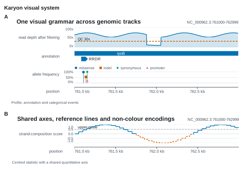
The figure is cargo run --example visual_system. None of this section has a
command line flag.
Named profiles
use karyon::{plot, RenderProfile};

let figure = plot("chr1:1-10000")?
    .profile(RenderProfile::Presentation)
    .add_coverage(depth)
    .into_figure();
A profile sets the theme, the visual scale and the density in one call:
| Profile | Theme | Visual scale | Density | For |
|---|---|---|---|---|
Compact |
light | 0.88 |
Compact |
dense multi-panel figures and narrow columns |
Manuscript |
light | 1.0 |
Balanced |
papers and vector editing; the default |
Presentation |
light | 1.35 |
Spacious |
projected slides |
Web |
light | 1.10 |
Balanced |
documentation and browsers |
Dark |
dark | 1.0 |
Balanced |
manuscript geometry on the dark palette |
The visual scale multiplies type, marks, bands, margins, gaps and corners
together. On a figure it never changes the image width or the coordinates, so a
larger scale makes a taller figure, not a wider one; on a sheet it scales the
panels as well. The density multiplies only what is inside the tracks, rows,
bands and marks: Compact is 0.84, Balanced 1.0 and Spacious 1.14.
Both are also settings of their own, visual_scale(f64) and density(Density).
profile is on Plot, Figure and Rings, where it sets all three, and on
Panels, Map and PhyloMap, where it sets the theme and the visual scale. It
replaces them, so call it first: a later theme, visual_scale or density
call overrides one part on purpose, and an earlier one is lost.
Theme::for_profile(profile) returns the profile's theme with its sizes already
scaled, for code that works with a theme directly. Hand it to theme(...) and
leave visual_scale at 1.0, or the type is scaled twice.
Tokens and emphasis
theme.tokens is a VisualTokens, the measurements that axes, guides, markers,
features and legends share, in pixels:
| Token | Default | Measures |
|---|---|---|
hairline |
0.8 |
hairline guides and row separators |
stroke |
1.2 |
an ordinary data stroke |
strong_stroke |
2.0 |
a selected or primary stroke |
marker_radius |
3.0 |
the radius of a point |
tick_length |
5.0 |
an axis tick |
label_gap |
10.0 |
the air between a label and what it names |
row_gap |
3.0 |
the gap between repeated rows |
feature_height |
14.0 |
a gene or interval mark |
arrow_size |
8.0 |
the width of an arrowhead |
legend_swatch |
10.0 |
a legend swatch |
legend_gap |
16.0 |
the gap between legend entries |
area_opacity |
0.18 |
an area under a line, as an opacity |
Theme::scaled and VisualTokens::scaled multiply every size in the table
together; area_opacity is a fraction and stays as it is.
Emphasis says how prominent a mark is without naming a colour: Muted,
Normal (the default), Primary or Alert. theme.mark_style(emphasis)
resolves it into a MarkStyle of four measurable parts, which keeps a threshold
distinguishable when the colour is gone:
Emphasis |
stroke_width |
marker_radius |
opacity |
pattern |
|---|---|---|---|---|
Muted |
hairline |
0.8 × marker_radius |
0.55 |
LinePattern::Dotted |
Normal |
stroke |
marker_radius |
0.9 |
LinePattern::Solid |
Primary |
strong_stroke |
1.15 × marker_radius |
1.0 |
LinePattern::Solid |
Alert |
1.15 × strong_stroke |
1.25 × marker_radius |
1.0 |
LinePattern::Dashed |
LinePattern::dasharray() gives the SVG dash for each pattern: none for
Solid, 6 4 for Dashed and 1.5 3 for Dotted.
Shared quantitative axes
CoverageTrack, VariantTrack, ManhattanTrack and WindowTrack take the
same QuantitativeAxis through .axis(...), reference lines included, and
DynseqTrack::axis takes one for its value axis.
use karyon::{AxisFormat, CoverageTrack, Emphasis, QuantitativeAxis, ReferenceLine};

let axis = QuantitativeAxis::new()
    .range(0.0, 100.0)
    .ticks(3)
    .unit("x")
    .format(AxisFormat::Fixed(0))
    .reference(
        ReferenceLine::new(30.0)
            .label("QC 30x")
            .emphasis(Emphasis::Alert),
    );

let depth = CoverageTrack::new(start, values).axis(axis);
- Ticks land on round values, multiples of 1, 2, 2.5 or 5 times a power of ten, and an end you did not pin is rounded out to one of them: a depth that peaks at 71.46 is read against 0, 25, 50 and 75, not against 35.73 and 71.46.
ticks(n)asks for aboutnlabelled ticks, ends included, from 2 to 8; the default is 3.- The unit is written once, on the highest tick.
- Labels never overlap. A band too short to label every tick keeps a regular subset of them, counted from zero, and at the least its highest value.
- A pinned end is taken literally. Pin the same
rangeon figures that will be compared. AxisFormat::Auto, the default, writes compact values withkandMsuffixes.Fixed(places)andPercent(places)make the unit explicit;Percentshows a fraction as a percentage.
A ReferenceLine::new(value) starts with no label, Emphasis::Muted and
LinePattern::Dashed. It is drawn with the stroke width of its emphasis, in the
muted ink, or in the second palette colour when it is Alert (a
ManhattanTrack uses its significance colour there). It keeps its own pattern,
so it reads without colour, and its label is written exactly as given, just
above the line. A reference outside the axis range is not drawn.
Washes on large shapes
Genes, reads coloured by strand, domains, open reading frames, clade blocks and alignment cells with their letter written on them are large filled shapes. They wear a wash of their colour in the body and the full colour on the edge, and a label on top takes whichever ink reads on the wash. At full saturation eight such shapes make a colour chart rather than a figure. A shape too narrow to show a body is all edge and keeps the full colour.
Small marks go the other way. Variant heads, mismatches in a pileup and the cells
of an alignment drawn as differences keep the full colour, because they are what
the reader is looking for. Legend::area draws its swatch washed and edged like
the shapes it explains, so the key looks like the thing it names.
Labels and legends that adapt to space
- Track labels. The gutter is measured from the labels and capped at 160 pixels. A longer label is shortened with an ellipsis on the page, while the SVG's description keeps the full name.
- Titles. A title is shortened to fit beside the locus; the SVG's
<title>keeps it whole. - Feature names. The room a name needs is reserved while features are packed into rows, so a name never runs into a neighbour. A name too long for its feature is drawn to its right, on the same row.
- Names on a circle. A
FeatureRingwithshow_names(true)writes each name just inside the ring, shortened to the room left before the centre line, or centred on its arc where that room would not hold a letter, and leaves out any that would collide. The arc keeps its name and coordinates in its tooltip. - Legends wrap onto another row rather than drop a key. A
VariantTrackgrows taller when a narrow plot needs more legend rows, and its legend shows each category's point shape.
Your own track can use the same two tools, fit_text and text_width, from
Fonts and text measurement.
Panels that align the data
On a Panels sheet, the data of every linear figure starts at the same x by
default, so a panel with a long track label and a panel with no gutter still
line up. Circular and free-form drawings have no linear origin and keep their
natural left edge.
use karyon::Panels;

Panels::new()
    .align_plot_areas(true)
    .push(&coverage, "A")
    .push(&variants, "B")
    .save_svg("comparison.svg")?;
Panels::visual_scale scales the drawings already added together with the
letters, captions, gaps and margins. Panels::row_major makes a regular grid
when the rows carry meaning; the default flow, column by column, is the more
compact choice for a long figure of unequal panels. The rest of Panels is on
The Rust API.
Colour is never the only cue
- Categorical points change shape as well as colour.
- Reference lines and thresholds carry a line pattern; a windowed line is
dashed where it falls below its baseline as well as recoloured; and the
categories of a
MarkerRingcycle through solid, dashed and dotted ticks. - Every document is named and described for screen readers (
<title>,<desc>androle="img"), and a mark you can point at carries its exact values in a tooltip.
None of these moves a position or changes a value, a category, a label or their order. They are what keeps a figure readable in greyscale print and under colour vision deficiency.
Where next
-
Where a theme and a profile attach, and the settings of figures, sheets and circular plots.
-
How a track of your own reads the theme it is handed.
-
Complete figures to start from.
-
--theme,--colorand the rest of the flags.